
Words are design too
An era tag reading “2026” made vintage pieces sound brand new. Changing it to ’70s, ’80s and ’90s fixed the concept, not just the copy.
A brand, Instagram kit and website for a small upstairs vintage shop. The shop is fictional; every design decision is real.
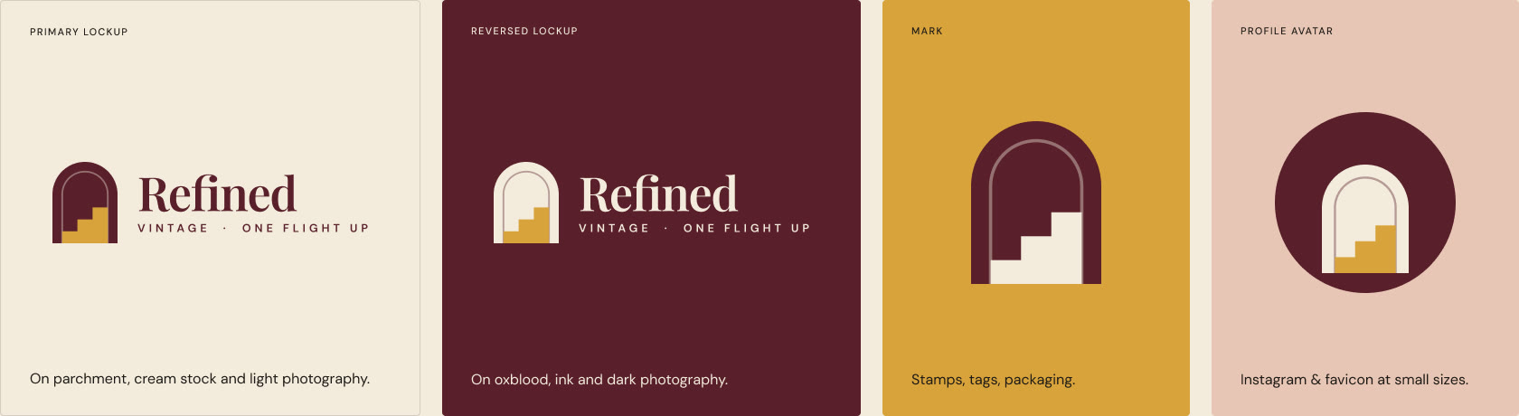
The shop sits upstairs, above a bakery, so the identity is built from the climb: an arched doorway with a staircase inside. The same mark works as a logo, a stamp on tags, a favicon and an Instagram avatar.
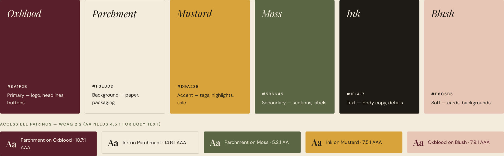
Warm, worn tones you’d find on old fabric labels. Every colour has a role, and every text pairing was checked against WCAG contrast. Moss was darkened until small text passed AA.
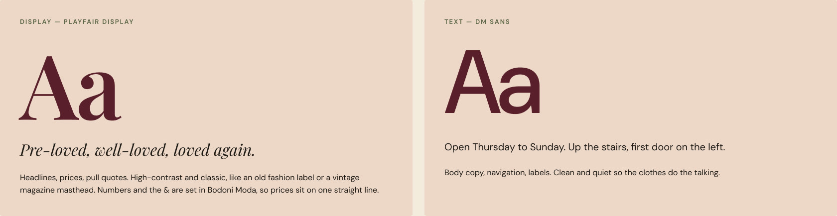
Playfair Display feels like a vintage magazine masthead; DM Sans stays out of the way so the clothes do the talking. Prices use Bodoni Moda numerals so they sit on one straight line. I tried Fraunces first and dropped it: its decorative letterforms didn’t feel right for the brand.
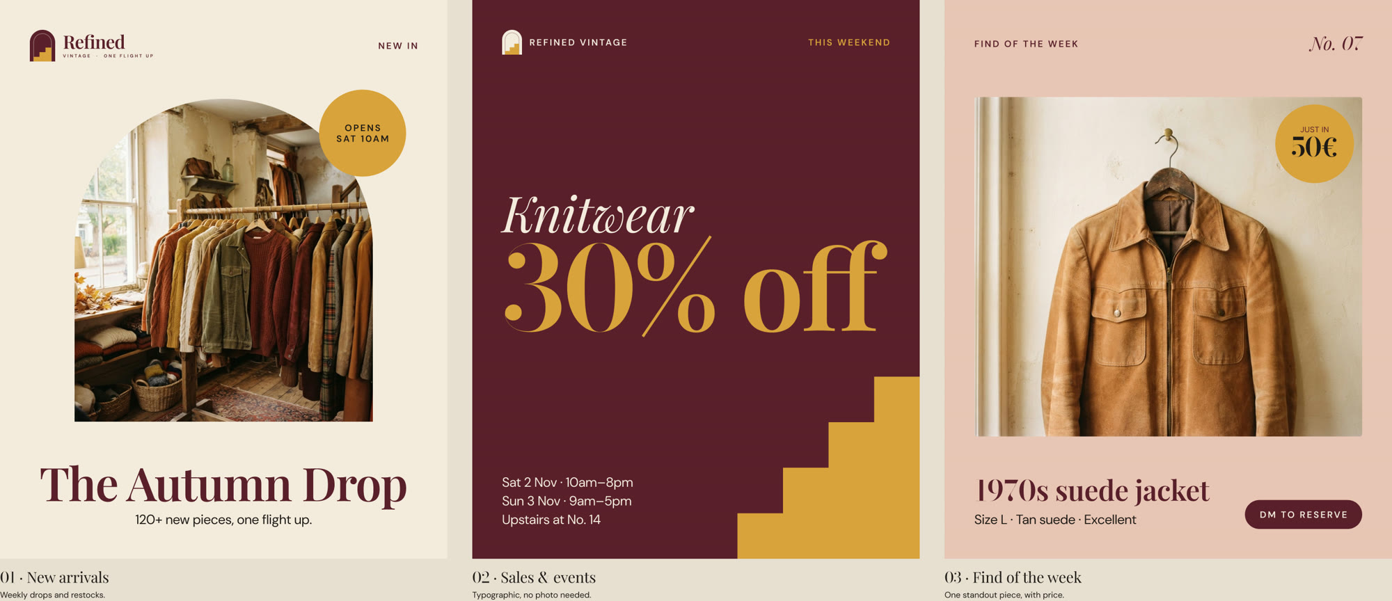
Three 4:5 Instagram templates, built as Figma components. Headlines, details and photos are properties, so the owner can publish without breaking the layout.
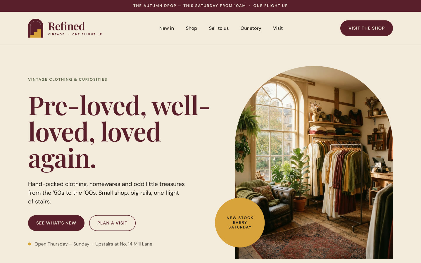
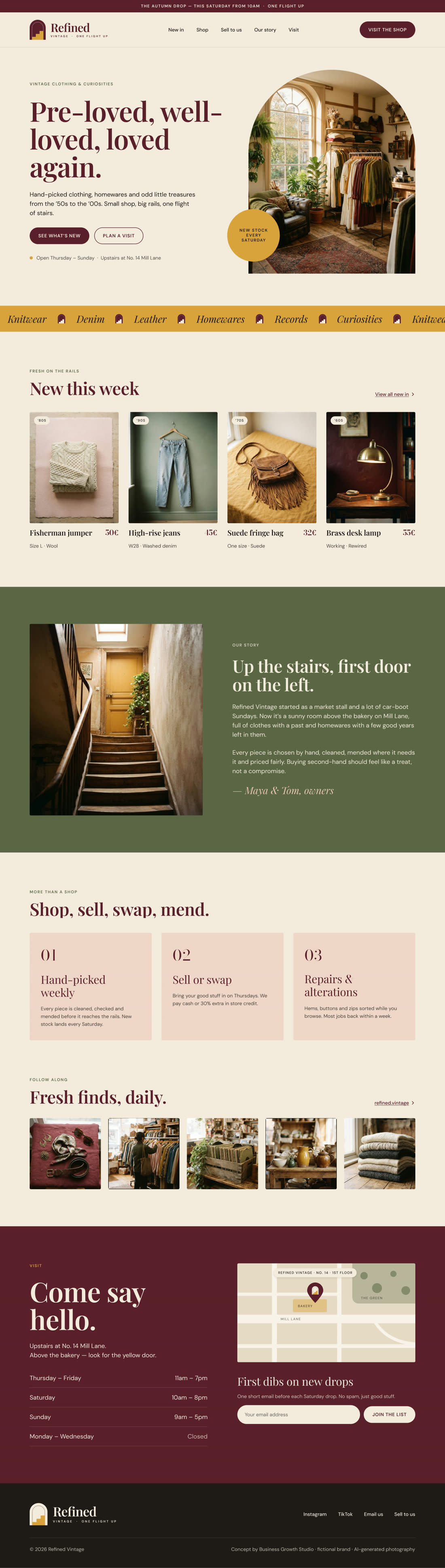
The homepage answers what a customer actually needs: what’s new, what it costs, how to sell or mend clothes, and how to find a door that’s up a flight of stairs, with opening hours and an illustrated map.

An era tag reading “2026” made vintage pieces sound brand new. Changing it to ’70s, ’80s and ’90s fixed the concept, not just the copy.
Moss looked fine but failed contrast for small text. A slightly darker shade passes and nobody notices the change, except the people who need it.
Products became a swipeable carousel, buttons went full width and the Instagram grid gained a “Follow” tile.
Tell me where you are and where you want to be. I’ll reply within one business day with honest next steps — even if that means you don’t need me yet.