
Compare fairly, or you compare volume
One track was much louder, and louder always sounds better at first. I levelled both to the same loudness before anyone voted.
A 16-second Instagram Reel for Refined Vintage, the upstairs shop from my brand concept. One job: tell a local shopper the shop exists, show what it sells, and make them remember when it’s open.
The shop is one flight up, above a bakery, so most people walk right past it. The ad starts by asking you to look up, then climbs the stairs with you. Every move comes from the brand itself: the arched doorway, the staircase in the logo, the price stickers and the swipe of the shop’s website.
I wrote the script and storyboard before animating anything. Each scene has one job, and all text stays inside Instagram’s safe area, so the buttons and caption never cover it.
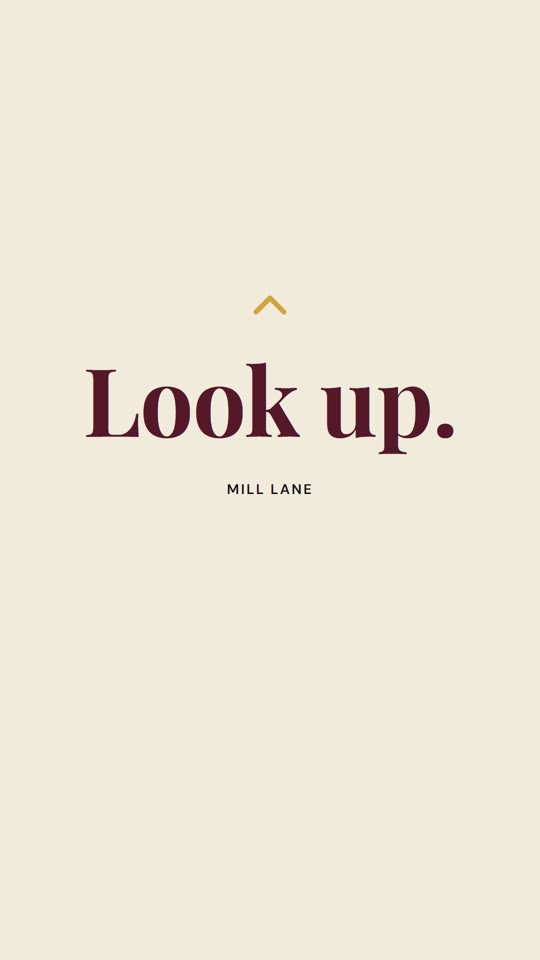 0–1.8sLook up.The hook is already on screen in the first frame, so even the thumbnail makes you stop.
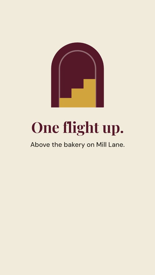 1.2–5.2sOne flight upThe camera tilts up to the logo. Its arch draws, the stairs step in, then we zoom through the door.
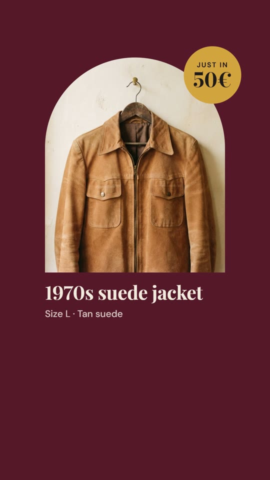 5.2–7.1sThe piecesThree real pieces with size and price, swiped in like the carousel on the shop’s website.
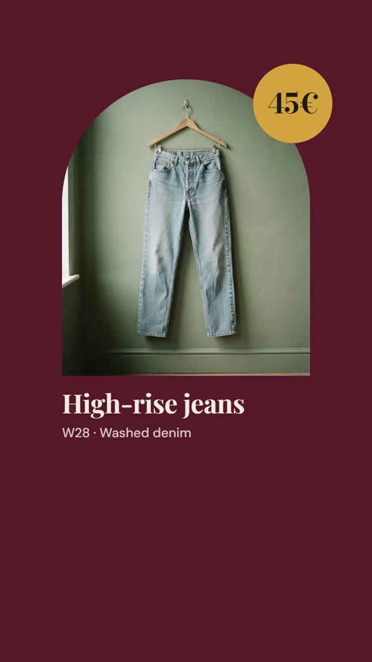 7.1–10.4sSwipeThe same mustard price sticker as the Instagram templates, so the ad and the feed feel like one brand.
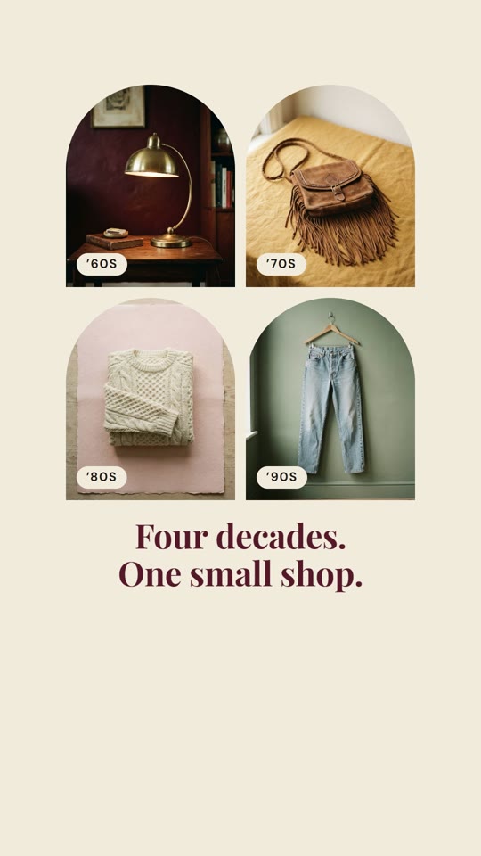 10.4–13.5sFour decadesThe last piece shrinks into a grid, and the era tags explain what the shop is in two lines.
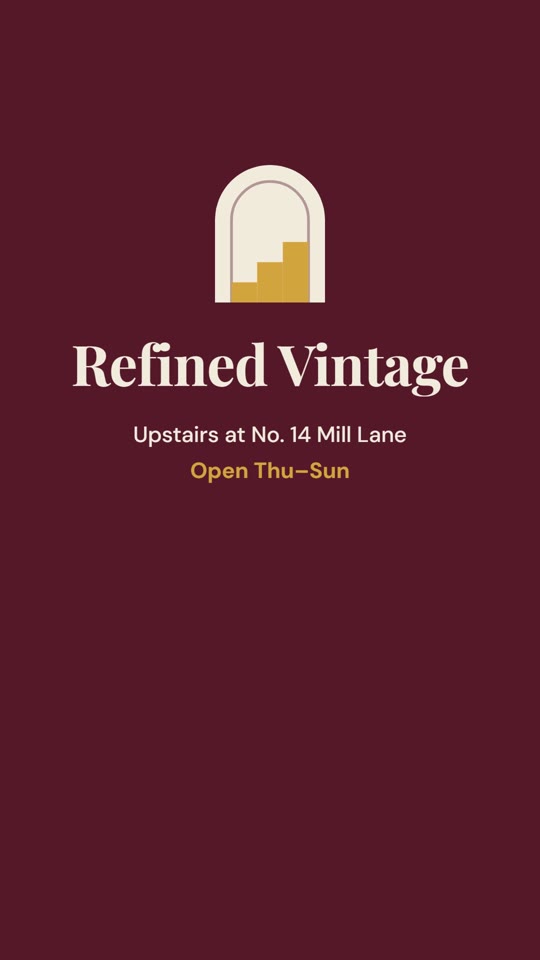 12.8–16sVisitA doorway opens onto the sign: name, address and opening hours, held long enough to remember.
No effects for the sake of effects. The camera tilts because you’re looking up, it zooms through the arch because you’re going inside, and products swipe because that’s how you browse them on a phone. The ad is built in code with HyperFrames, so every frame is exact and easy to change.
I wanted music made by people, not AI. I made two complete versions of the ad, each with a different sixties-style track, and showed both to three people. All three picked the same one: it felt natural, while the other felt like it was trying too hard to sell.
Then I measured the track’s tempo (127 beats per minute) and moved five key moments by a fraction of a second, so each zoom, swipe and doorway lands exactly on a beat.
One track was much louder, and louder always sounds better at first. I levelled both to the same loudness before anyone voted.
Both tracks were good, but one felt like an advert that tried too hard. Everyone who watched picked the one that felt like an invitation.
Checks showed some lines left the screen before they could be read. Adding one second to the whole ad fixed it without slowing the edit.
Tell me where you are and where you want to be. I’ll reply within one business day with honest next steps — even if that means you don’t need me yet.