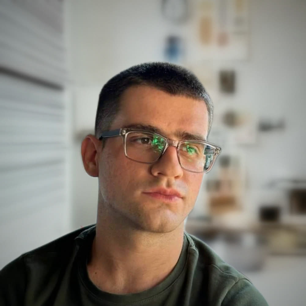
Letters that were cut off
The word-reveal animation was trimming descenders like g, y and p. I spotted it, and the mask was rebuilt so every letter shows in full.
Brand, website and motion for my own one-person studio. Built to look as confident as the brands I admire, and to be honest about who I am: a junior designer starting out.
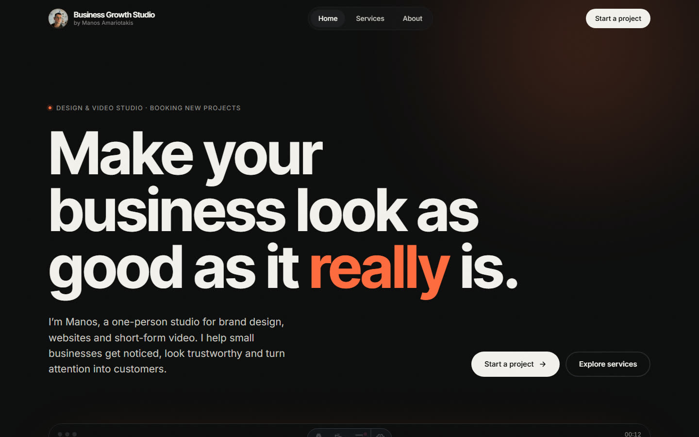
Small businesses judge a designer by their own website first. Mine had to prove, in a few seconds, that I can make a business look professional, without inventing clients, numbers or reviews I don’t have yet.
I collected ten homepages I admire in Figma, plus a growth agency I like, and looked for what they had in common instead of copying any one of them.
The palette stays almost monochrome so the orange can do all the pointing. Headlines use Inter Tight; emphasis comes from colour, not from a second typeface. The key spacing follows an 8px grid.
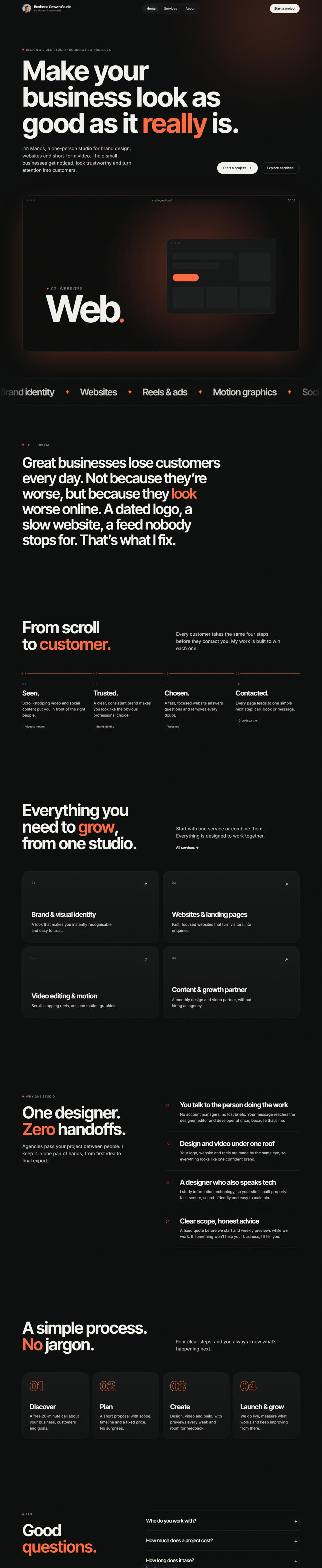
I reviewed the first build the way a demanding client would: page by page, on desktop and on my phone, in a 22-point document. A few of the fixes:
The word-reveal animation was trimming descenders like g, y and p. I spotted it, and the mask was rebuilt so every letter shows in full.
On phones, “grow,” split so the comma started a new line. Punctuation now always stays glued to its word.
I measured every gap and set them to grid values: 320px between sections, 24px from label to headline.
The process numbers almost disappeared. I tested a white outline against an orange one and chose orange.
An italic serif for highlighted words looked off-brand. Emphasis is now carried by colour alone.
A placeholder email pointed to a domain owned by someone else. It was replaced before anything went live.
Headlines reveal word by word, a key sentence lights up as you scroll, and the hero plays a 12-second showreel loop: Brand, Web, Video, Growth, then the logo. The loop was made in HyperFrames, as HTML animated with GSAP, then exported at just 253 KB.
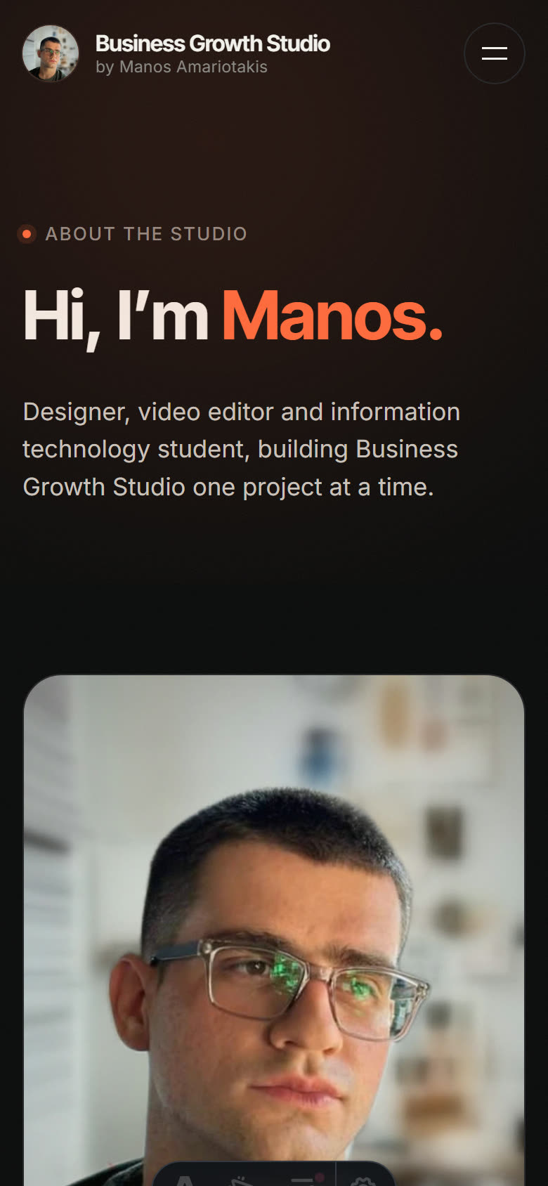
Most small-business owners will see this site on a phone, so I reviewed it on mine over Wi-Fi before signing anything off.
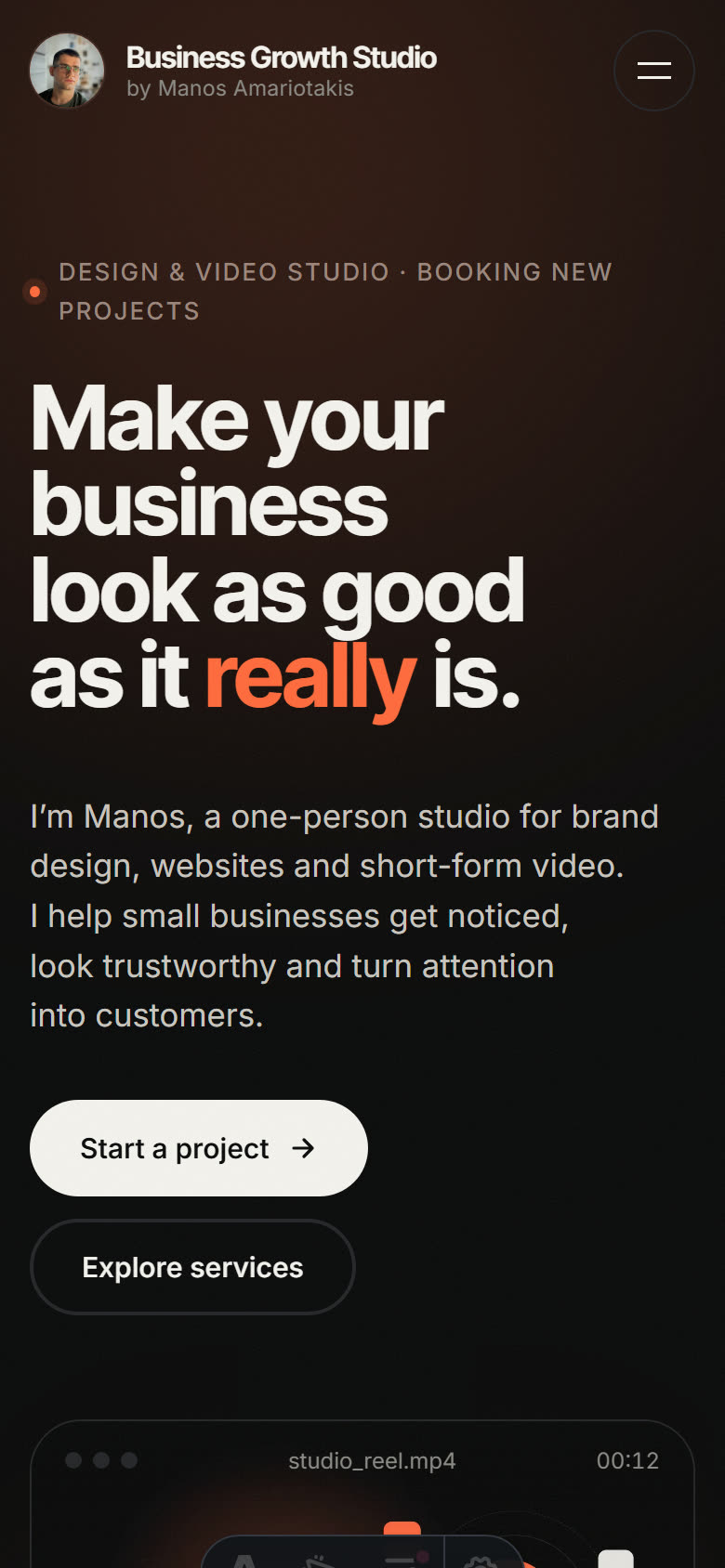
What I learned: good design is mostly review. The first version looked finished; the details are what made it feel professional.
Tell me where you are and where you want to be. I’ll reply within one business day with honest next steps — even if that means you don’t need me yet.